Features
MarkdownAccessibility
Externa ships user-first accessibility in the authenticated shell: high contrast and reduce motion in the user menu, OS media queries honored without a toggle, and a skip link into main#main-content. Target is WCAG 2.2 AA across the admin. From externa-core 1.4.0, CI enforces it with an axe browser smoke suite, eslint-plugin-jsx-a11y, and a theme-token contrast check (#252–#255).
Related
Personal theme (light/dark): Account settings. Shell layout: Architecture.
User preferences
| Preference | Effect | Storage |
|---|---|---|
| High contrast | Stronger semantic shadcn tokens (--foreground, --muted-foreground, --border, sidebar, …) | localStorage + cookie accessibility_high_contrast=1 |
| Reduce motion | Forces reduced animations/transitions when the OS does not already ask | localStorage + cookie accessibility_reduce_motion=1 |
UI: user menu → Accessibility submenu (summary Off / N on), same checkmark pattern as Appearance/Language.
Hook: resources/js/hooks/use-accessibility-preferences.tsx (sibling of useAppearance). Blade boot via HandleAppearance + app.blade.php stamps high-contrast / reduce-motion on <html> before paint (cookies are not encrypted — see bootstrap/app.php).
OS media queries (always on)
| Query | Behavior |
|---|---|
prefers-reduced-motion: reduce | Motion kill in CSS — no user toggle required |
prefers-contrast: more | Same token bumps as .high-contrast without forcing the menu toggle |
The user Reduce motion class only adds force-on when the OS preference is off. High contrast from the OS does not require the menu class.
Skip link & landmark
Authenticated layouts (app-sidebar-layout, app-header-layout) and the auth simple layout:
SkipToContent— first focusable control, visible on:focus- Target
main#main-content(tabIndex={-1}for programmatic focus)
The sidebar (desktop and mobile sheet) and the header variant render a real <nav aria-label="Main navigation">; file-detail and chat asides are labelled landmarks.
Focus, overlays, and announcements (1.4.0)
- Focus ring: every control has a visible, offset, full-opacity focus ring and 3:1 input borders (WCAG 1.4.11 / 2.4.7).
- Overlays: Sheet, Drawer, Dialog, and the file detail panel return focus to the control that opened them.
- Navigation: after an Inertia page visit, focus moves to
#main-content. - Live regions: toasts, notifications, the AI final answer, empty-table status, and the settings save bar ("Saving" / "Saved") are announced through polite or assertive live regions.
- Reduced motion: targeted rules keep Radix / vaul overlays unmounting correctly while motion is reduced.
- Language:
<html lang>follows the UI locale; content-locale switches carrylangand text alternatives for flags. - Icon-only buttons have translated
a11y.*labels (en / it / de); decorative icons are hidden from assistive tech.
Brand colours and contrast
Theme tokens (default qiick teal, light, dark, and high-contrast) pass WCAG 2.2 AA: 4.5:1 for text, 3:1 for UI components, borders, and focus indicators. Primary hover states keep AA contrast in both themes.
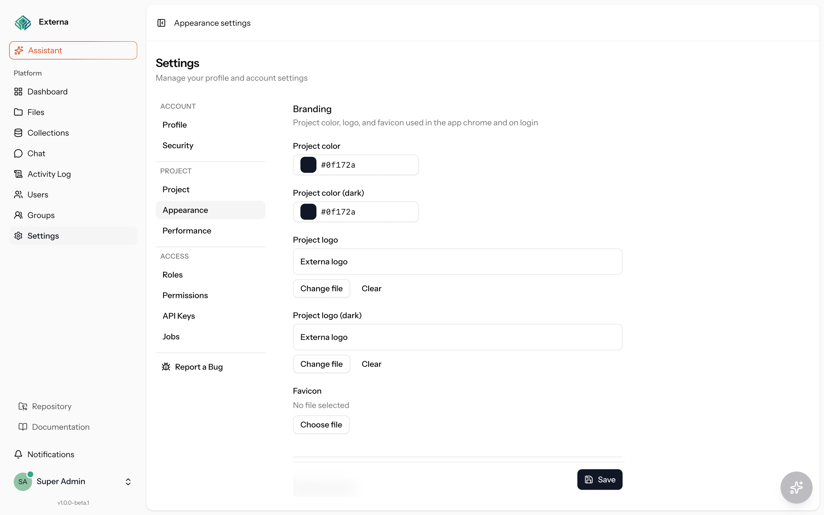
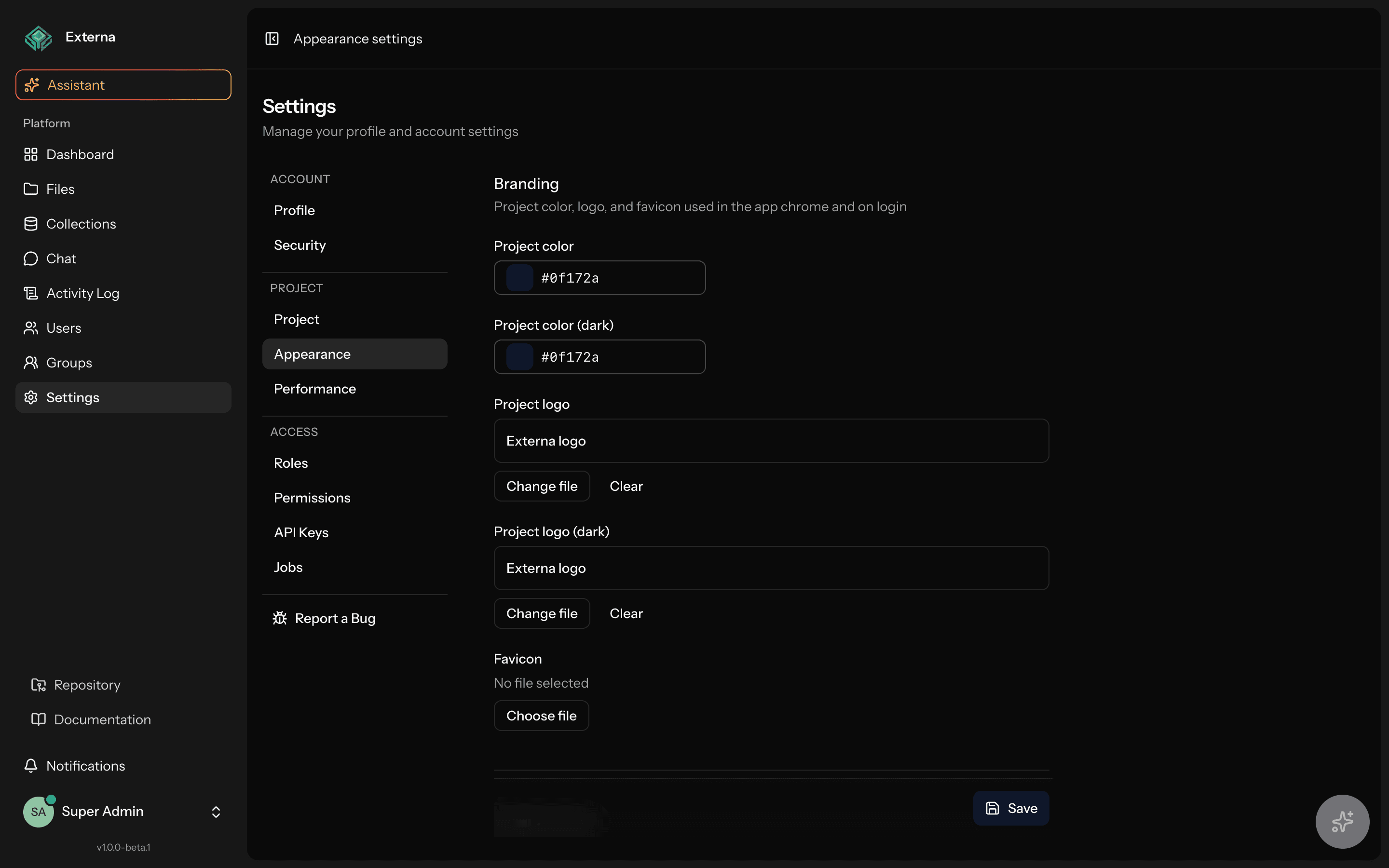
A custom brand colour from Project settings → Appearance is used for the focus ring only when it reaches 3:1 against the page background; otherwise the teal ring stays (#453). Status is never shown by colour alone. A low-contrast brand can still weaken other brand-coloured surfaces, so check your colour in light and dark, or use high-contrast mode.
Automated checks (externa-core CI)
| Gate | What it checks |
|---|---|
| Axe browser smoke | tests/Browser/A11ySmokeBrowserTest.php (Pest Browser) fails on critical/serious axe issues on login and key authenticated routes (dashboard, collections, items, item edit, files, users, profile, appearance, project settings, /ai) in light, dark, and high-contrast. Required browser check on code PRs. |
eslint-plugin-jsx-a11y | Errors on shared React components, warnings on pages |
npm run a11y:contrast | Checks the documented theme-token pairs (docs/a11y-contrast-pairs.md) for light, dark, high-contrast, and high-contrast dark. Default brand only |
| Other browser tests | Landmarks, focus and announcements, accessibility preferences |
Manual coverage lives in core docs/a11y-screen-reader-checklist.md, and known limits of third-party widgets (TipTap, CodeMirror / markdown editor, Leaflet, react-day-picker, recharts, SortableJS) with their mitigations are listed in docs/a11y-third-party-limits.md. A passing axe smoke does not cover those widgets.
Still open: font size / dyslexia fonts.
Source map
| Concern | Location |
|---|---|
| Hook | resources/js/hooks/use-accessibility-preferences.tsx |
| Menu | resources/js/components/user-menu-content.tsx |
| Skip link | resources/js/components/skip-to-content.tsx |
| CSS | resources/css/app.css (.high-contrast, @media) |
| Blade / cookies | resources/views/app.blade.php, HandleAppearance |
| Tests | tests/Feature/AccessibilityPreferencesTest.php, tests/Browser/AccessibilityPreferencesBrowserTest.php, tests/Browser/A11y*BrowserTest.php |
| Contrast script | scripts/a11y-contrast.mjs (npm run a11y:contrast) |